
Poster Guidelines
- NOTE NEW SIZE: The graphical area of the poster board is 48 inches high x 48 inches wide, however the poster itself can be smaller;
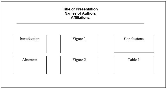
- Prepare a label for the top of your poster space indicating the title and authors;
- Lettering should not be less than one and one-half inches;
- Illustrations should be similar to those you would use in making slides but more heavily drawn;
- One or two authors MUST be in attendance during the presentation times;
- Pushpins will be provided.

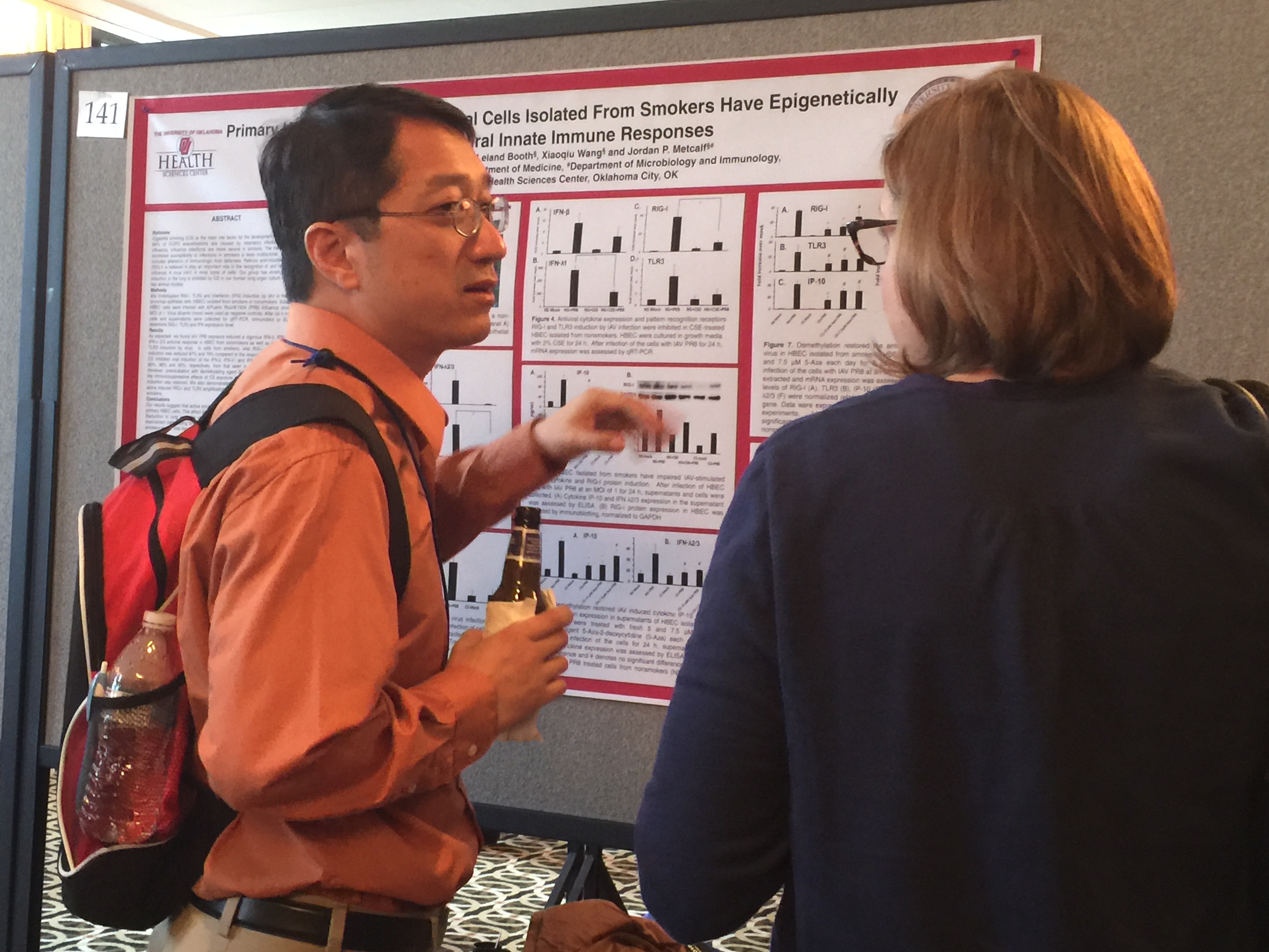
Above all, a poster should be a networking tool. The primary purpose of a poster is not to communicate every little detail of your fantastic research, but rather to attract people’s attention and serve as a conversation starter.
What they want is for you to share the story of your research and engage in informal conversation about it. Repeat after me, a poster is a conversation starter. And the poster is not going to do the talking for you.
Second, a poster is a communication tool. A poster should use visuals to draw people in from a distance. Then, as people step closer and begin reading it, go ahead and give the background information necessary so that they can put your work into context, understand what you have done, why you have done it, and come to realize its broader impact.
Does this ring a bell? It’s no coincidence that the key information you’d include in your poster is the same information that you’d find in any scientific abstract. And here’s the secret: a scientific poster is simply a visual abstractIt’s also known as a graphical abstract. A concise and visual summary of your research. Its purpose is to be accessible and to drive attention to your research.
Learn more: https://www.animateyour.science/post/how-to-design-an-award-winning-conference-poster